Within Morgan goodwin I was primarily working on edge:ctp, a combined trading platform targeted at small / medium businesses looking to get into international trade.After the Freeagent campaign and doing work towards rebranding edge:ctp and EDGE:CTP Tariff Tools, we were told to go back to the previous style due to time concerns.
A new animated intro was created for tariff tools tutroials under the old branding as we were unable to use the rebrand work we had made for tariff tools specifically.
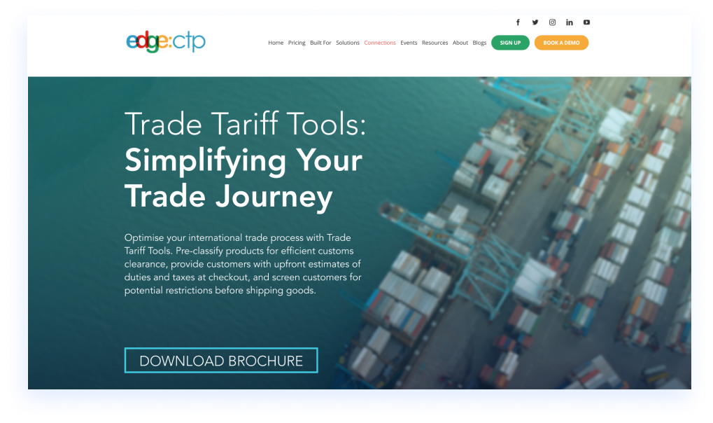
After creating all the rebrand material (including websites designs) for both edge:ctp and EDGE:CTP tariff tools, unfortunately it remained unused and we went back to our previous style, so using the experience gained from the previous designs, I was tasked to create a new landing page using the original edge:ctp style guide.
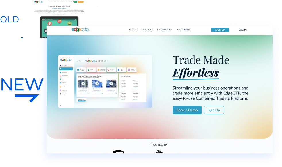
I was tasked with creating an updated look to the software due to the current dashboard on the web app looking outdated and leaving new users confused when first logging-on.
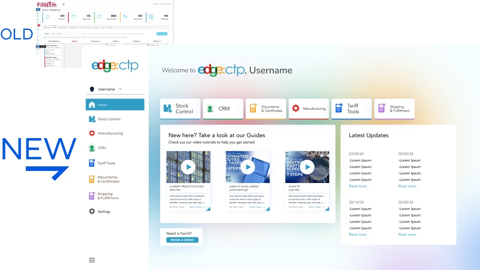
After reflecting on our marketing plan after finishing up the FreeAgent campaign, we concluded that the current website and branding was not fit for our target audience and went with the decision to rebrand edge:ctp to appeal more to target audience, look more professional to build trust and refresh outdated elements within the old style.Unfortunately due to shifting focus to Tariff Tools, this went unused.
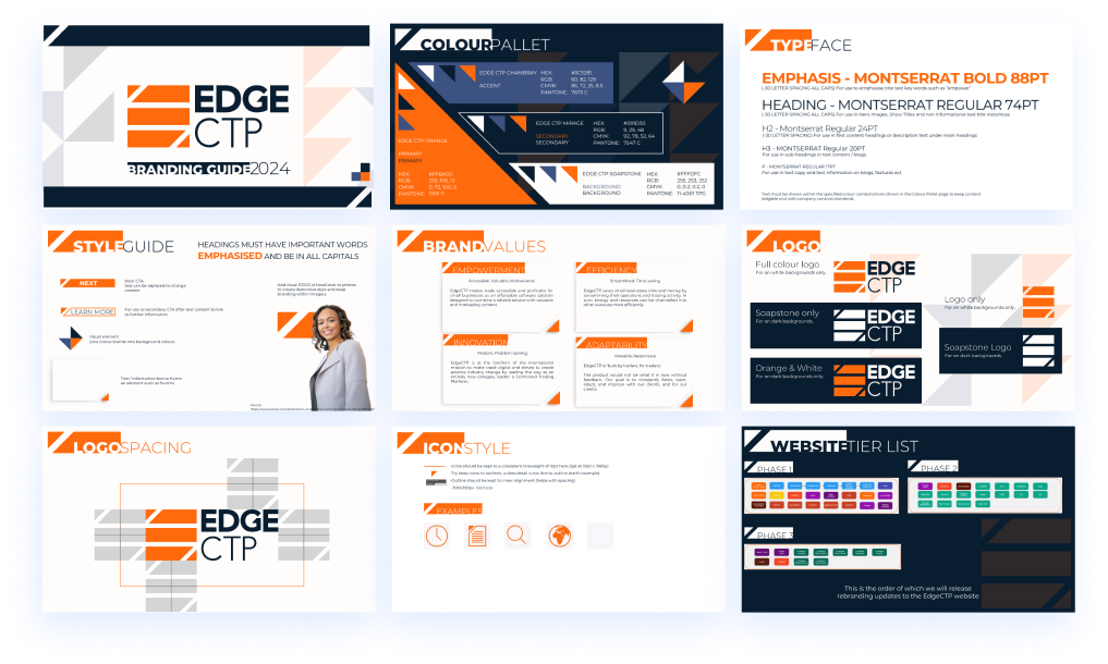
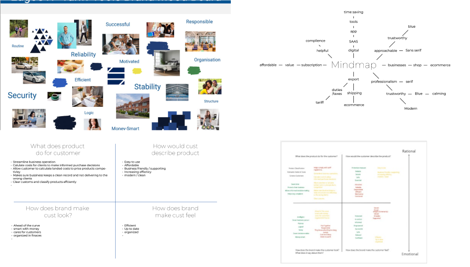
We did countless research into our target audience and what we wanted to achieve with our revised brand voice and brand persona.I also researched more into other logos and iconic logo design in order to create the best logo to represent the new edge:ctp.
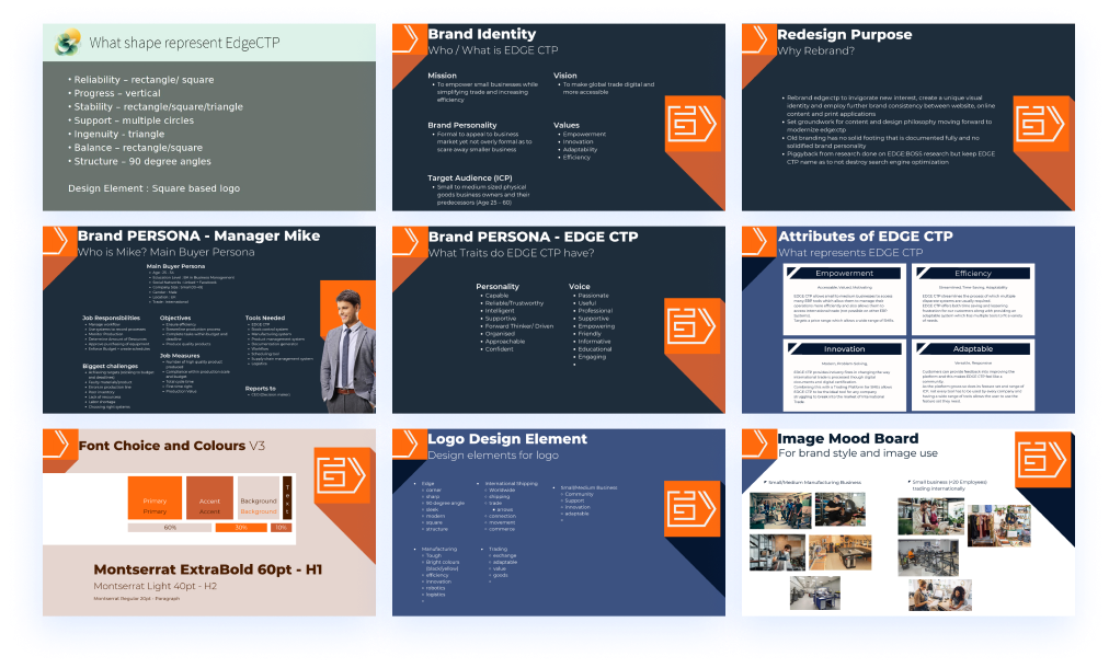
Next was to create sketches for the logo, one of the main things that wasn’t fit for ICP on the previous logo was its rounded edges and colour pallet. We aimed to rectify this with a simpler colour pallet and sharper, more modern logo design.
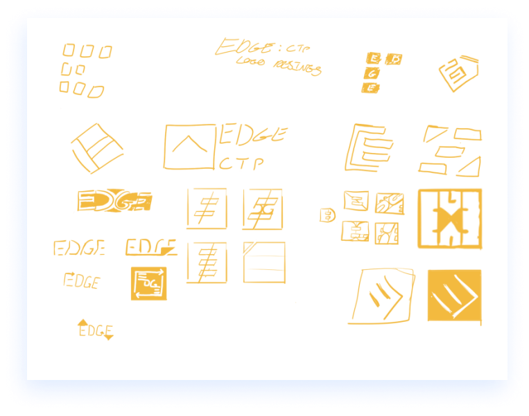
Sketches were developed into a range of vector based concepts in Illustrator, which in turn created a large range of idea, some more fitting to brief than others (It’s always good to experiment!).
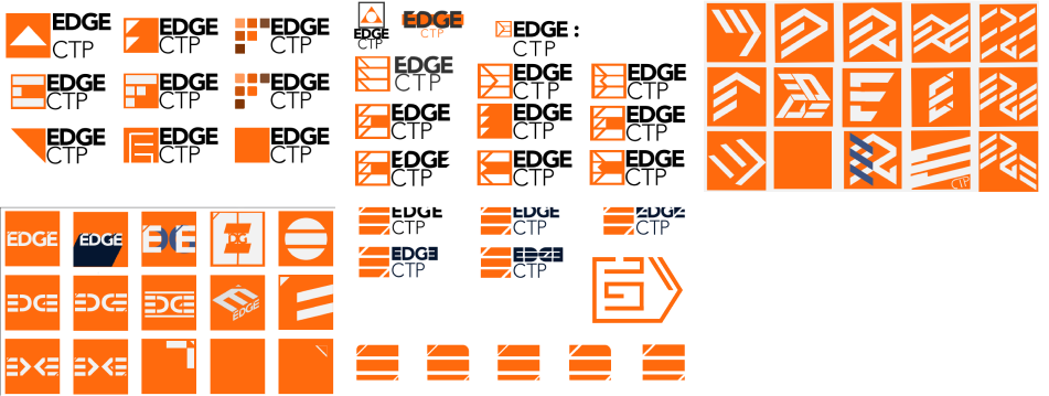
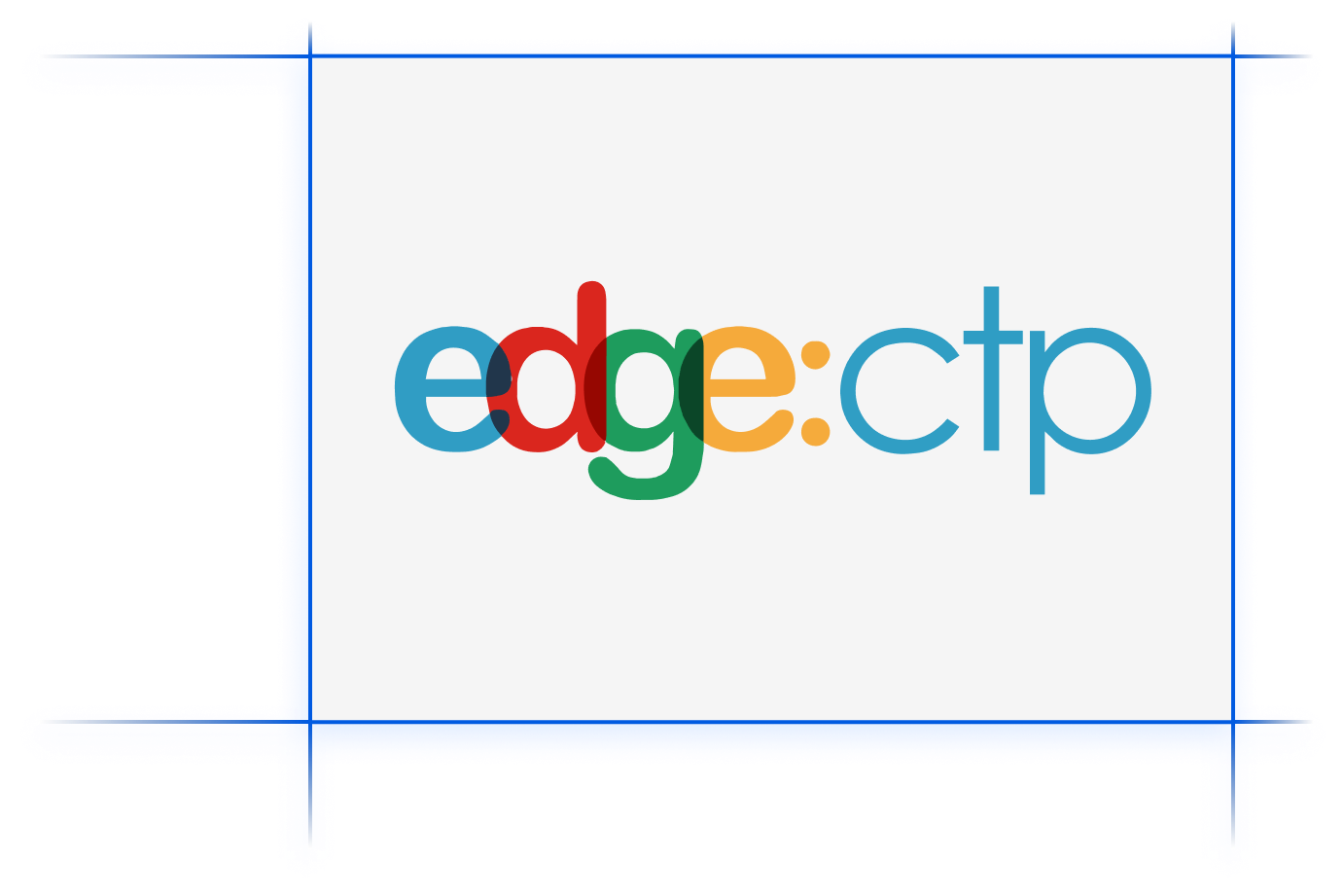
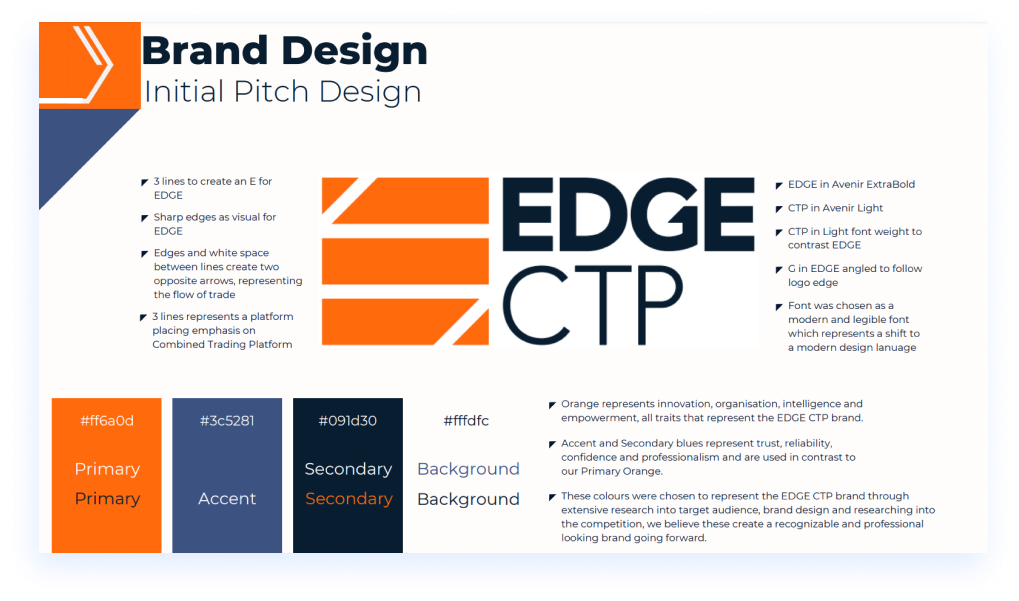
After countless revisions we went with this as the final design for the logo.This was presented to the rest of the team to universal praise and was approved to go forward to further development to redesign the website to represent the new branding.
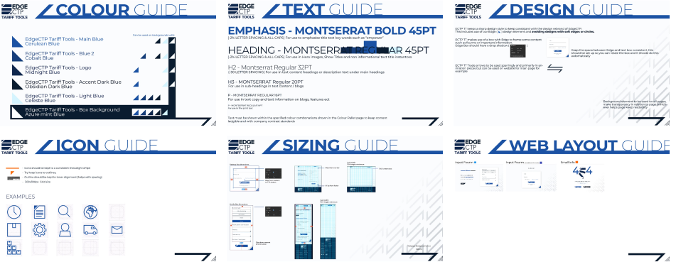
After finalizing the logo and branding ideas, we finalized our plan and proceeded to create a brand guide to create consistency for all future content and help create the guidelines for which the website will adhere too.
A multitude of ideas and concepts were made for the website which never got brought forward to the final design but vastly improved my web design skills along with learning the many hurdles of designing with target audience in mind.
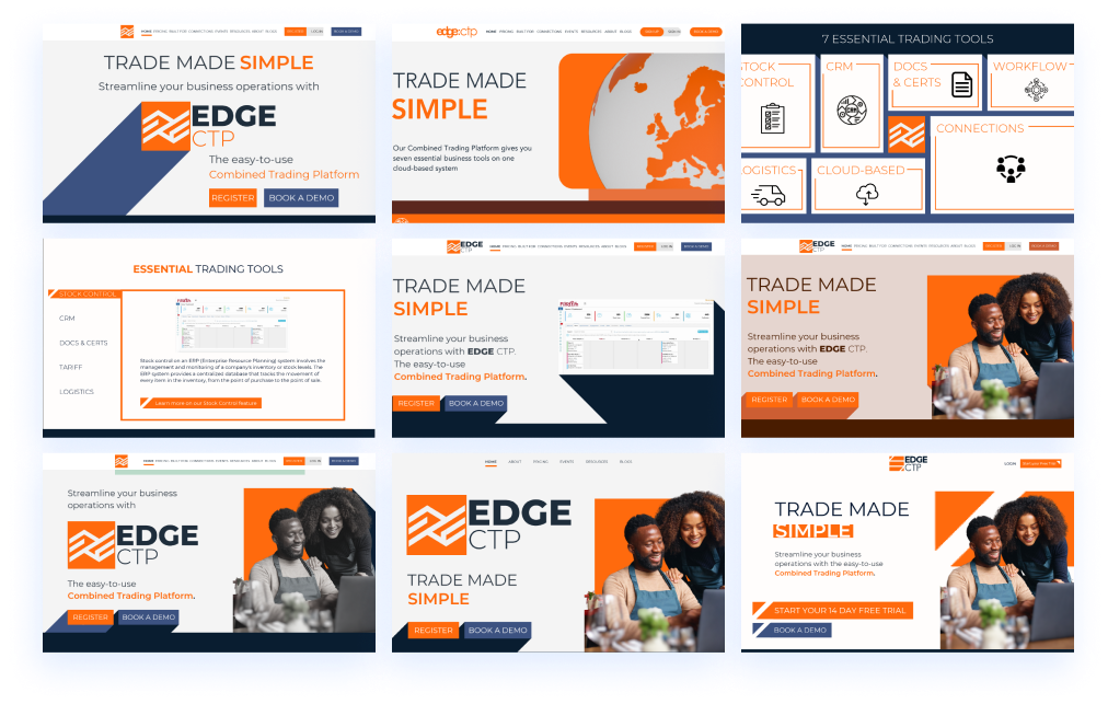
Being my 3rd webpage design with the company but first time creating a whole website, it had a strict learning curve that I had to quickly learn and adapt too, but through intuition and previous planning a few pages were done in a short time frame.By this time I had a stronger grasp on how to use figma and how to make things easier for the developers
A new animated intro was created for the rebrand to introduce the new revised logo and new brand image.
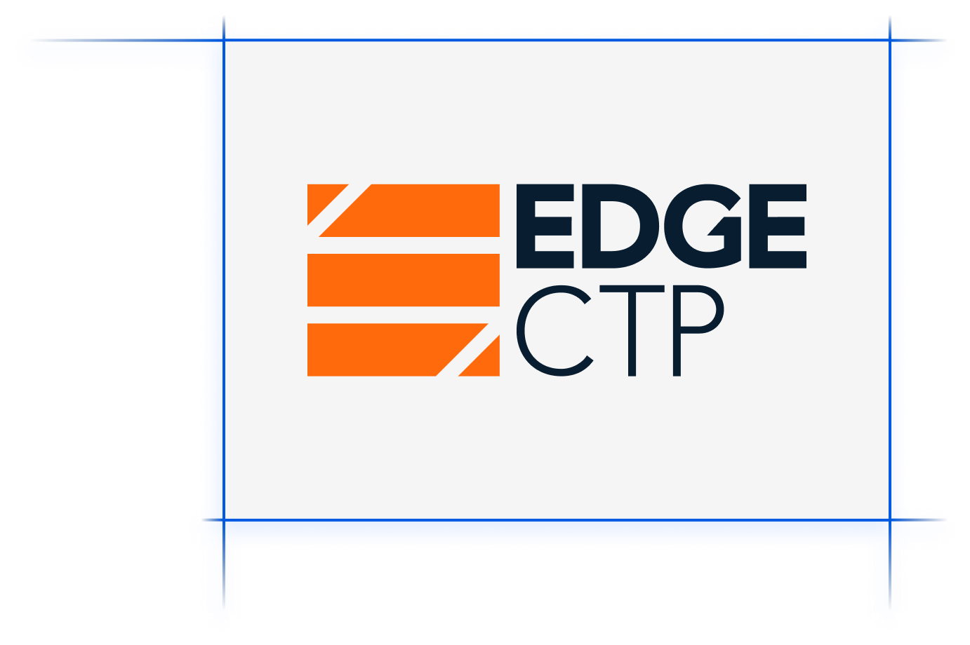
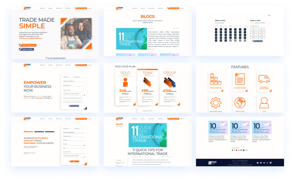
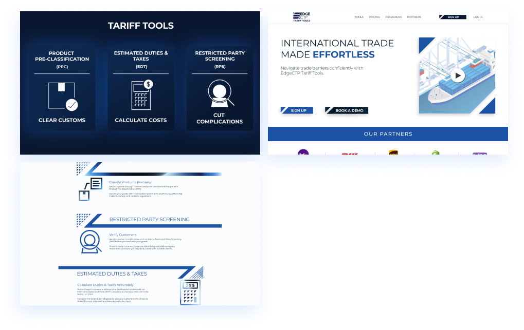
Due to increasing popularity of our Tariff Tools section of edge:ctp, it was decided to put these 3 features (Product Pre-Classification, Estimated Duties & Taxes and Restricted Party Screening) into their own software in collaboration with a big shipping company in the US. Due to this we planned to push marketing into rebranding this as new software to a different target audience than edge:ctp.
While we were researching and developing the rebrand for EDGE:CTP Tariff Tools, we were required to put up a webpage for the new featureset, so within a short time frame this page was designed and developed for the edege:ctp website.
One of the tasks we did to create a basis for design and brand tone of voice was creating a mood board to know where to place Tariff Tools within the SAAS market.A lot of the research and development from the edge:ctp rebrand was reused here including the logo. Only a slight change of ICP was required to target the niche we wanted to target.
In order to create a consistent brand voice and image between the team and future designers, a rough brand guidelines was created in order to keep the team heading in the right direction.
Website development was started very soon after shifting focus onto Tariff Tools as a lot of the web design could be used from the unreleased edge:ctp rebrand website designs due to simular brand design and image ideas.
Being the teams biggest project yet many months of research, development, designs and revisions were made before we were ready to present the final website and push our marketing plan into this new and exciting direction, unfortunately last minute we could not use any of the stuff we had developed and thus it remains on the cutting room floor.
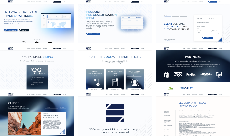
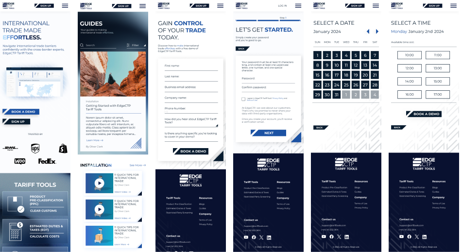
Due to the popularity of web browsing on mobile devices, we found it important to make our website responsive to these smaller screen sizes which required slight design changes.
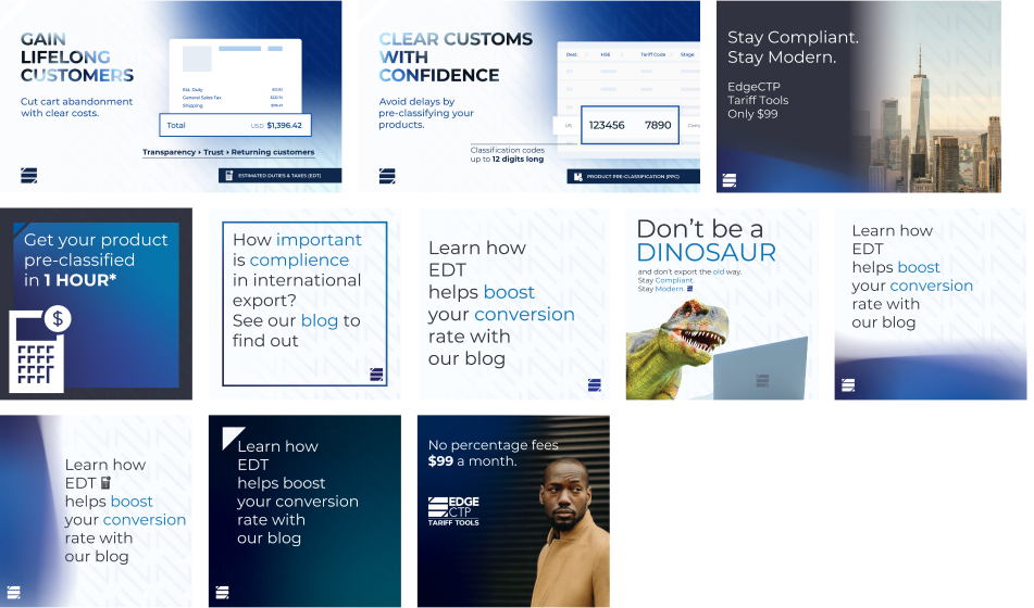
For our socials we had to create multiple designs for our new content plan, here are some of those ideas / concepts.
When I first started at Morgan Goodwin edge:ctp had just recently collaborated with FreeAgent, a friendly looking accountancy SAAS of which some of their customers found tools in edge:ctp such as stock control very useful.During this marketing campaign the majority of my workload consisted of animations to accompany tutorial videos regarding the integration.
For the tutorial videos regarding the integration I was tasked to create short animations to accompany explanations and features as to keep the videos engaging. For my first work with the company it was important to try find the company design style, brand values and personality but there was no prior documentation on these.
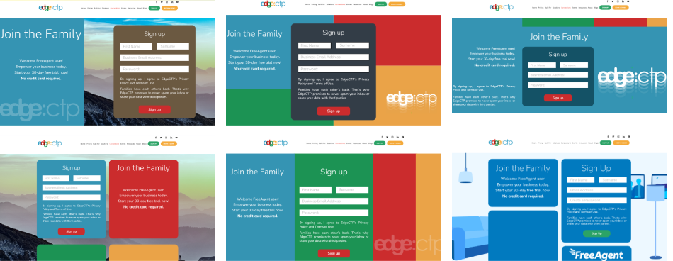
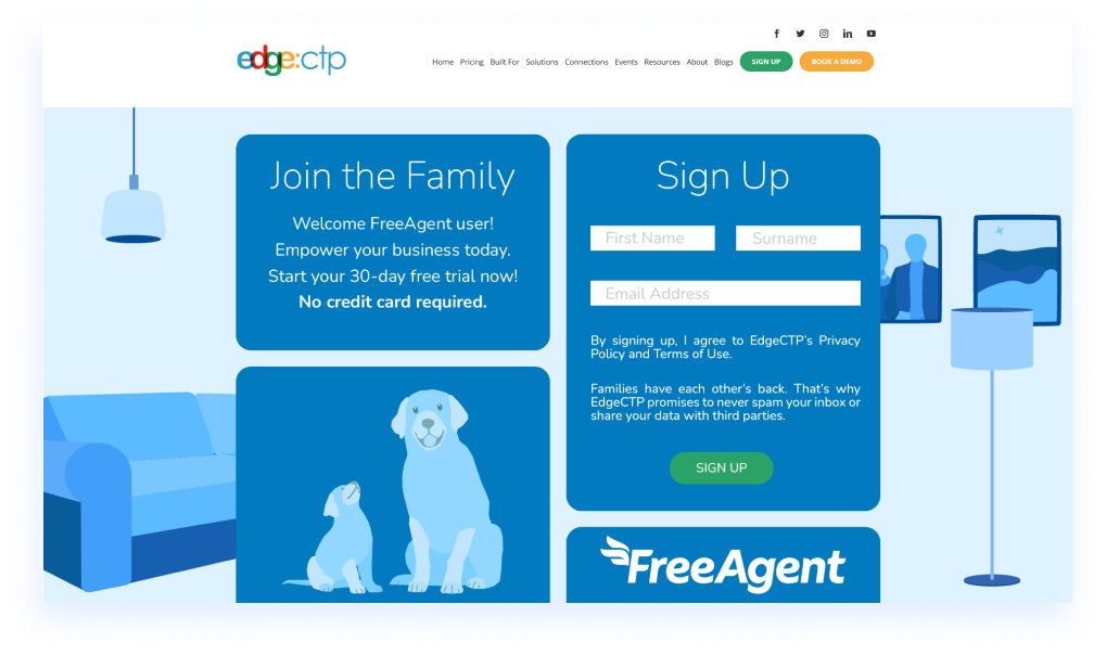
As part of our campaign of our 30 day free trial promotion, we created a FreeAgent specific sign up page for those signing up to edge:ctp through FreeAgent’s website or the FreeAgent section of the edge:ctp website.As my first web design for the company some more research into general web design and planning was done to create the best design I could in the timeframe.
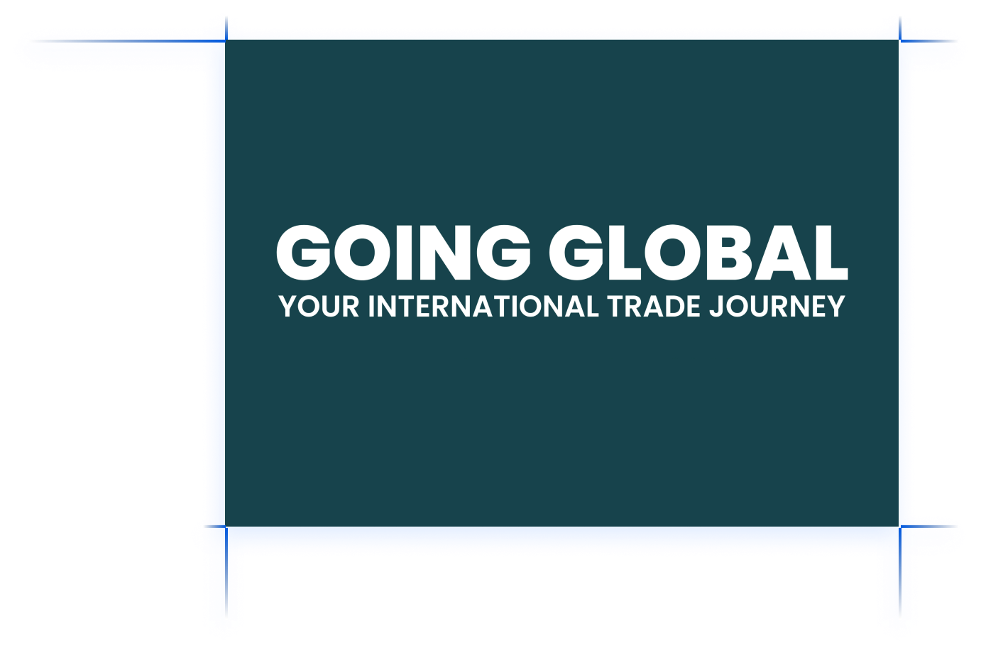
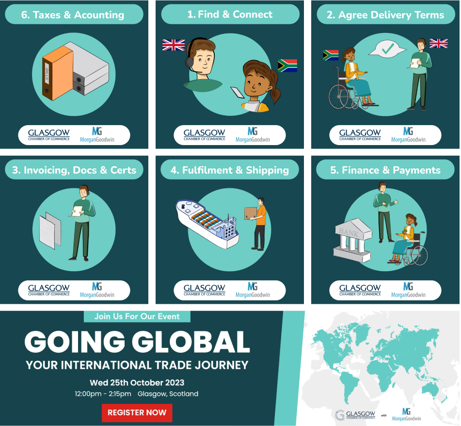
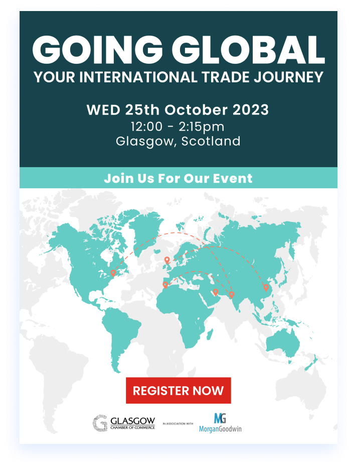
In October 2023, Morgan Goodwin announced an event called Going Global: Your International Trade Journey. This event was meant to explain and educate those in small to medium businesses about every step involved in trading your goods internationally.
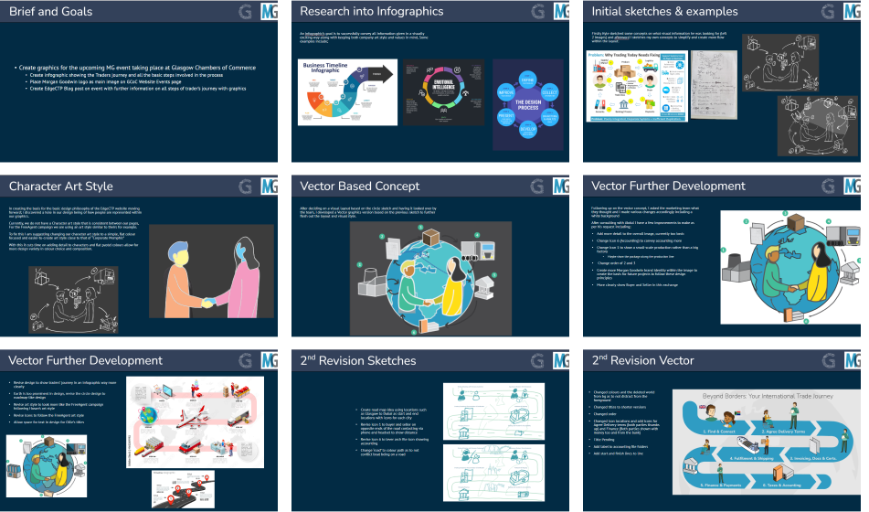
The hero image for the Going Global webpage was of an infographic clearly explaining all the steps of international trade in a short and easy to understand manner.Being one of my early projects I made sure to do research and revisions to create the right design for purpose.
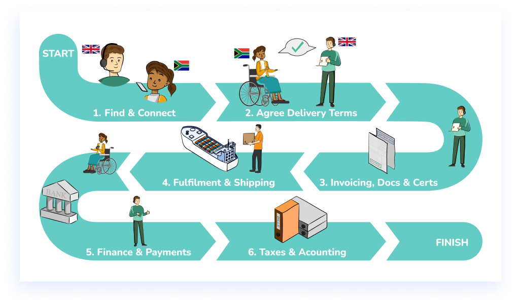
For our social media marketing plan we went through each of the steps individually along with an accompanying graphic.
In the same style we created other materal to build more interest in the event
For a limited time before the event, a popup would appear in the edge:ctp website in order to promote the event, sadly, attendance was still very low and thus the event was cancelled days before it was set to happen.
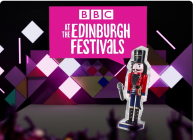
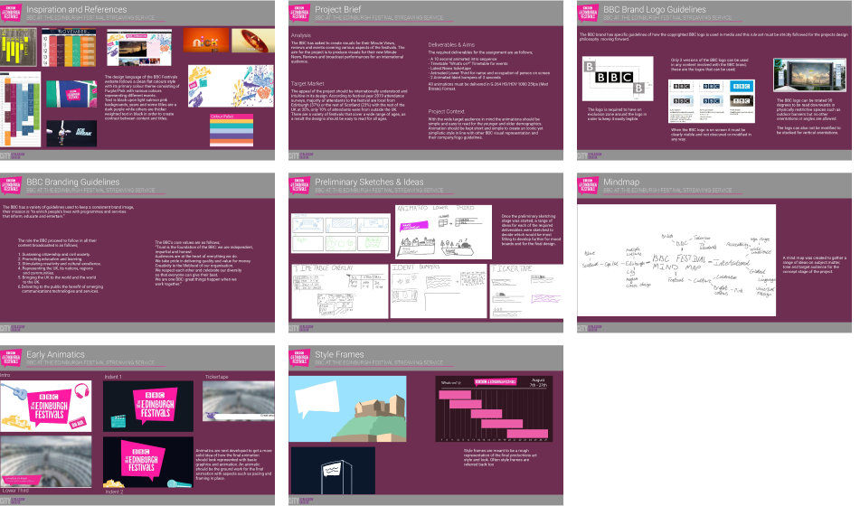
For my Graded Unit in HND Digital Design I was tasked with creating a motion graphics presentation for the upcoming BBC at the Edinburgh Festivals.
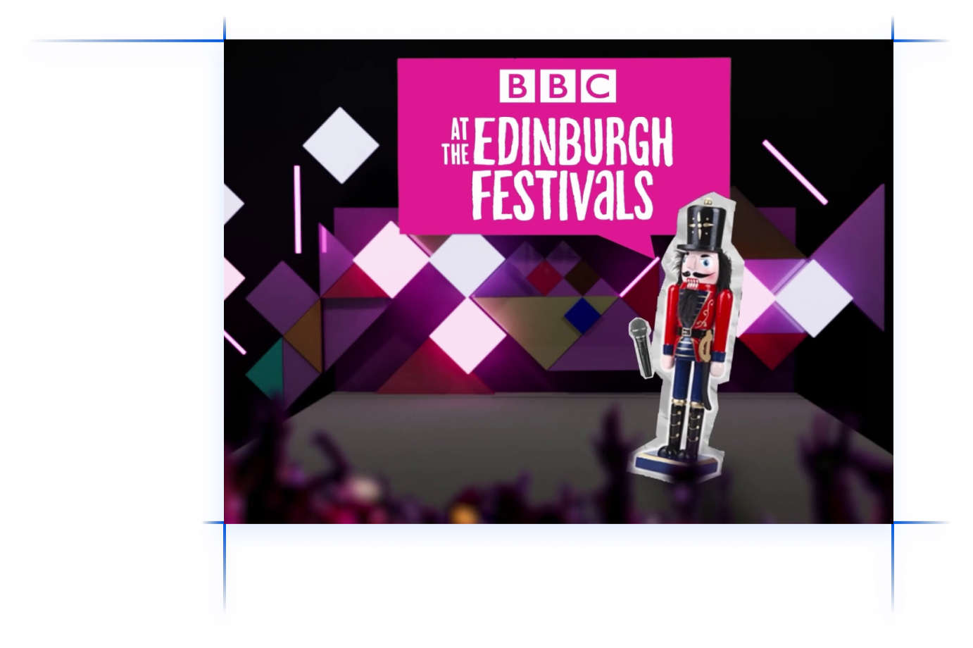
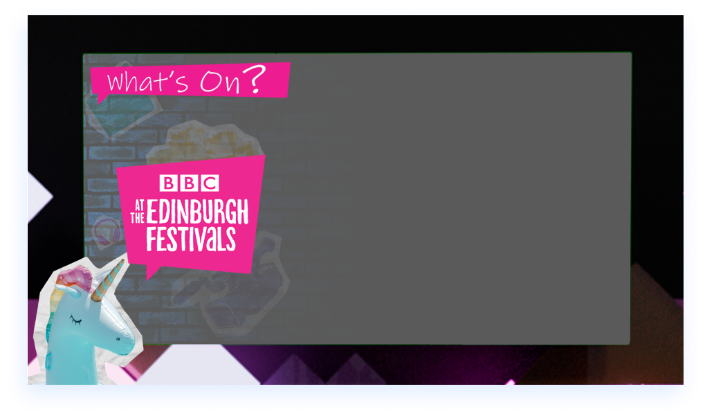
For our brief we were given a strict rule set to abide to BBC branding rules along with creating multiple motion graphics that could be broadcasted or streamed on BBC services. The animations were to be created to “stream up to the minute news, reviews and entire performances/events covering various aspects of the festivals, bringing the Edinburgh experience to a global audience.” As a result the deliverables required were as follows; “BBC Festivals animated programme intro sequence – 10secsAnimated”, “What’s On/Timetable overlay”, “Latest News Tickertape”, “Animated Lower Third – Left and Right” and “Ident Bumper – 2 x 3secs”. Along with these extensive planning and development timeline was required to present to the class before submitting the final project for grading.
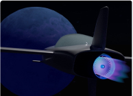
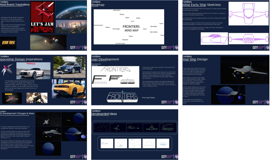
This is the intro to a new programme called Frontiers, a new science programme exploring the latest and greatest discoveries in the world. The animation was to reflect the nature of the show and a sufficient research and development timeline was required.
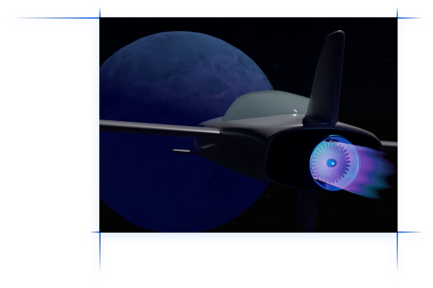
For this project I was required to create 20 seconds of 3D animation as an intro to a new programme called Frontiers, a new science programme exploring the latest and greatest discoveries in the world. The animation was to reflect the nature of the show and a sufficient research and development timeline was required.
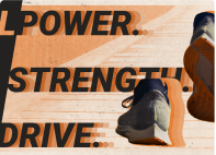
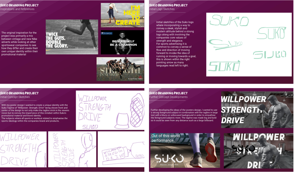
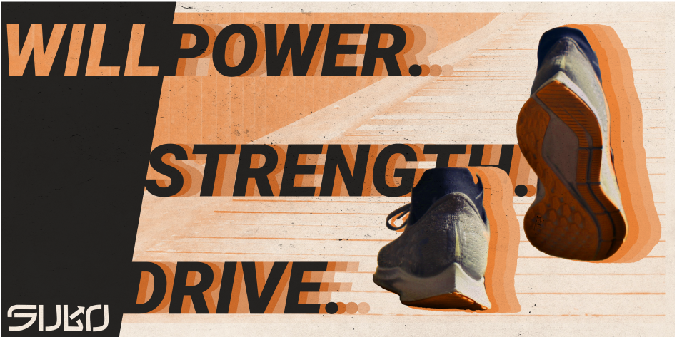
In this college project a (fake) brand called Suko was looking for a promotional poster to promote the brand against the likes of Adidas and Nike but must include their new tagline “Power, Strength, Drive”. We were required to do market research and create an effective eye-catching poster.
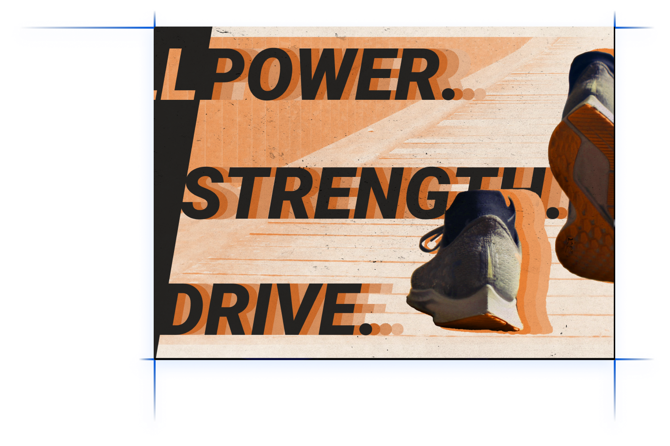
As of the clients requests according to the brief given, the poster had a list of requirements and goals it has to achieve to be satisfactory, these goals are as follows;-Must bring forward Suko core brand values such as empowerment, diversity and inclusivity-Include the tag line “Willpower, Strength, Drive”-Help create a healthier mindset and a healthier planet through sport-Visually striking advert for ages 15-35
The final design incorporates all the design elements I set to achieve and invokes a vintage yet timeless feeling within its design. The orange colour scheme was chosen to represent Joy, energy, heat and health which are some of many of the core values behind Suko’s brand identity and this is how I represented that. After Images were added to the text and shoes to emphasise movement and speed and they were coloured inline with the orange representation Shoes were chosen as the core subject as Suko is a sportswear brand and shoes are not only our way of moving forward but a core product in Suko’s catalogue. A dirt and old paper overlays were used to invoke a timeless feeling within the design and warm all the colours in the image to stay inline with the colour scheme.
During my second year doing Digital Design in College the United Nations Climate Change Conference was holding a competition for us students to create a range of animations to accompany the TV broadcast of the event during interviews and intermissions. While my animations were not picked to be broadcasted they received praise from my peers and lecturers, shown here is the working process behind planning and producing these Motion Graphics.
To start the project we were given a brief overview of the requirements that the client needed and are as follows; “Magazine style programme produced by City of Glasgow College students during COP26 conference. Programme will be recorded in college studio and include conversation with guests related to environmental issues and the COP26 conference. Presenters will most likely be TV or Journalism students.” Along with this we were given a target audience of “International and naturally slanted towards youth (18 – 26)” and the style of the produced motion graphics to be “Upbeat, serious but not staid or boring.”. Our 4 deliverables for the project were; “10 - 15 seconds opening titles”, “Bottom of frame captions (lowerThird) to identify presenters, contributors, locations, etc – including essential graphics (.mogrt)”, “30 second end credit sequence” and “Interstitial sting/s: (text tbc) to separate programme components”.
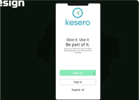
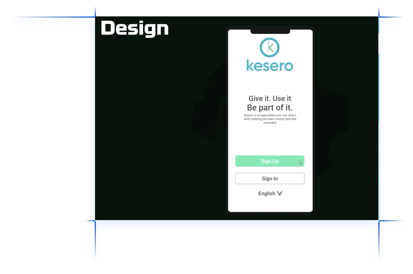
In college for our app/web design unit we were tasked with creating a new onboarding service for Kesero, A peer teaching service where online courses are run by users and teaching classes gains the user points towards learning new courses. Kesero was having an issue getting users to engage with their app after signing up and so my task was to create an onboarding process to improve user retention when creating an account and to keep users on the platform.
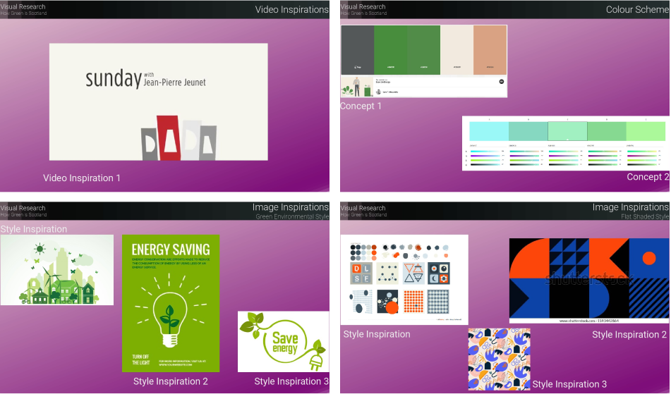
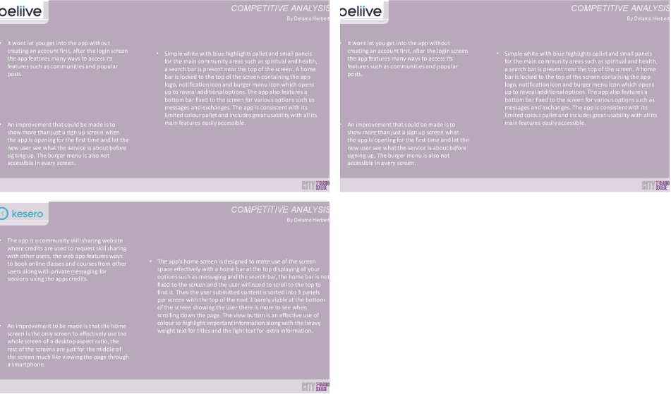
Firstly I looked at what competing apps did during their onboarding process on keep user retention and study what makes them successful or what can be improved on. On top of that i looked at what Kesero currently does within its onboarding process.
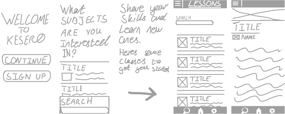
After brainstorming ideas for the onboarding process a range of sketches was created to develop the visual layout of the pages to optimize screen space and create an easy to follow flow though the sign up process.
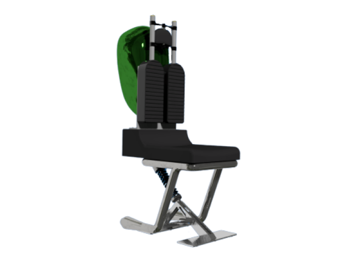
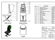
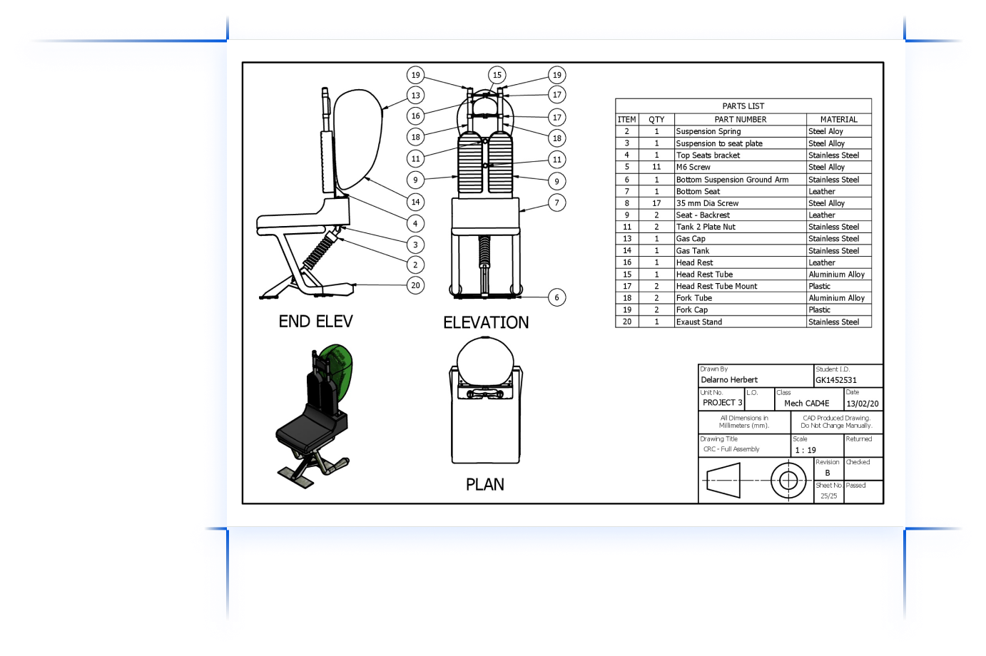
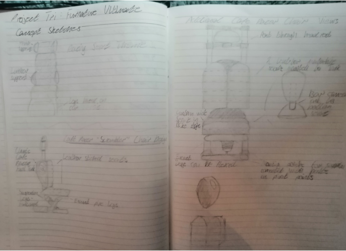
For my last full project in HNC Computer Aided Draught Design I was tasked with creating and presenting a chair made of multiple components created within Autodesk Inventor. In this project I created a decorative chair made of old motorcycle parts, I modelled each individual part and assembled them within Inventor.
I started this project with a good idea of what I wanted to build and as a result the sketchbook was brief but useful in putting my multiple ideas onto paper and solidifying the final design process.
Each part required was modelled in AutoCAD Inventor and based from various parts that would be from a Cafe Racer style bike.During this project I was doing my driving lessons but worried I wouldn't pass first time so I had a CBT bike licence and planned to get a bike if i couldn't pass my driving test, thankfully I passed first time!
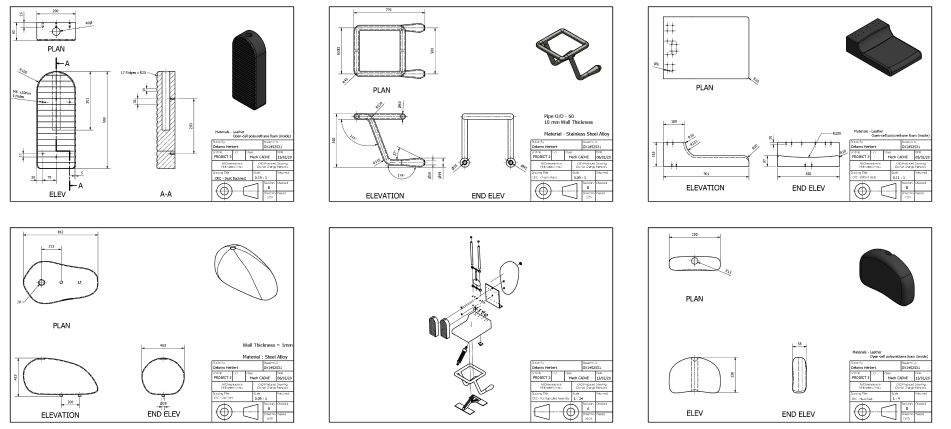
This was my first full render within a 3D software!